Star Trek. It’s a thing. Not only is it a thing, it’s also a big franchise. You might have heard of it. If you happen to fall into my sociodemographic bracket, you might not have particularly strong feelings about it, but you’re probably aware that many people do. I for one do not really care. I didn’t grow up with Star Trek like many people did, I grew up watching Stargate SG-1. You might think of that however you wish, but fact of the matter is that the new Star Trek: Discovery is the first Star Trek TV Show I watch as it airs. Yes, I’ve seen the rebooted JJ Abrams movies, and yes they kind of helped to make the franchise more accessible to people like me by basically starting fresh, but in this blogpost I’ll only focus on the shows. Shows I know little about. Shows I have not seen. Basically, I’m the perfect person to talk about these shows due to my lack of emotional investment, knowledge and oh wait I have no business talking about them. So, with Discovery having made it’s first impression, I thought it would be nice to put it into context a little, with all the other Star Trek stuff we had in the past. As someone who’s not that familiar with the franchise, I was a little surprised by the length of the wilderness years between the original series and the second live-action installment, as well as the relatively larg gap between the latest series and the new Dicscovery. I also didn’t realize how big the overlap between Deep Space Nine, Voyager and The Next Generation was, I always assumed they were more sequential. Anyway, I did my usual “pull data from <trakt.tv> and look at it”-thing, and here it goes.
Preparation Link to heading
We start by loading our favorite R packages for setup purposes:
| |
Next up, we’ll gather the data. Since these shows have ridiculously long titles in a world of single-word-shows, we’ll keep track of both titles and commonly used abbreviations. Please note that the data collection step is a little clunky, code-wise, but oh well, it get’s the job done.
| |
| |
The Data Link to heading
Here’s a randomly chosen sample of two episodes of each show to give you a rough idea of the data I’m working with. The dataset contains a few more variables, but I won’t be using them or they’re just variations on the variables below.
| |
| Show | Episode | First Aired | Rating | Votes |
|---|---|---|---|---|
| Star Trek | s01e02 | 1966-09-16 00:30:00 | 7.22 | 680 |
| Star Trek | s01e08 | 1966-10-28 00:30:00 | 6.87 | 449 |
| Star Trek: The Animated Series | s01e06 | 1973-10-13 04:00:00 | 6.76 | 109 |
| Star Trek: The Animated Series | s02e04 | 1974-09-28 04:00:00 | 7.63 | 87 |
| Star Trek: The Next Generation | s01e08 | 1987-11-10 02:00:00 | 7.30 | 580 |
| Star Trek: The Next Generation | s05e06 | 1991-10-29 02:00:00 | 7.66 | 415 |
| Star Trek: Deep Space Nine | s03e18 | 1995-04-10 04:00:00 | 7.36 | 240 |
| Star Trek: Voyager | s03e21 | 1997-04-09 04:00:00 | 7.67 | 341 |
| Star Trek: Deep Space Nine | s07e05 | 1998-10-28 05:00:00 | 7.36 | 265 |
| Star Trek: Voyager | s05e23 | 1999-05-05 04:00:00 | 6.99 | 305 |
| Star Trek: Enterprise | s02e11 | 2002-12-12 01:00:00 | 7.47 | 412 |
| Star Trek: Enterprise | s04e04 | 2004-10-30 00:00:00 | 7.60 | 416 |
| Star Trek: Discovery | s02e04 | 2019-02-08 01:30:00 | 7.76 | 2641 |
| Star Trek: Discovery | s02e11 | 2019-03-29 00:30:00 | 7.92 | 2510 |
You might notice a few things. First up, the vote count. While trakt.tv is pretty neat, it doesn’t have nearly the userbase of bigger sites like IMDb, nor has it been around for as long. Additionally, how many people do you know who not only rewatch older tv shows, but also take the time to rate each episode individually on sites like trakt? Exactly. That’s the biggest flaw I see in the data, as with all my trakt-data-shenanigans. The data is easy to retrieve, but unfortunately there’s not that much of it.
But oh well, who cares, I’m just here to put Discovery into a little perspective, so on we go. Throughout this post I’ll be shortening the show names to a more plot-friendly size, using these commonly used abbreviations for reference:
| |
| Title | Abbreviation |
|---|---|
| Star Trek | TOS |
| Star Trek: The Animated Series | TAS |
| Star Trek: The Next Generation | TNG |
| Star Trek: Deep Space Nine | DS9 |
| Star Trek: Voyager | VOY |
| Star Trek: Enterprise | ENT |
| Star Trek: Discovery | DSC |
The Timeline Link to heading
| |

| |
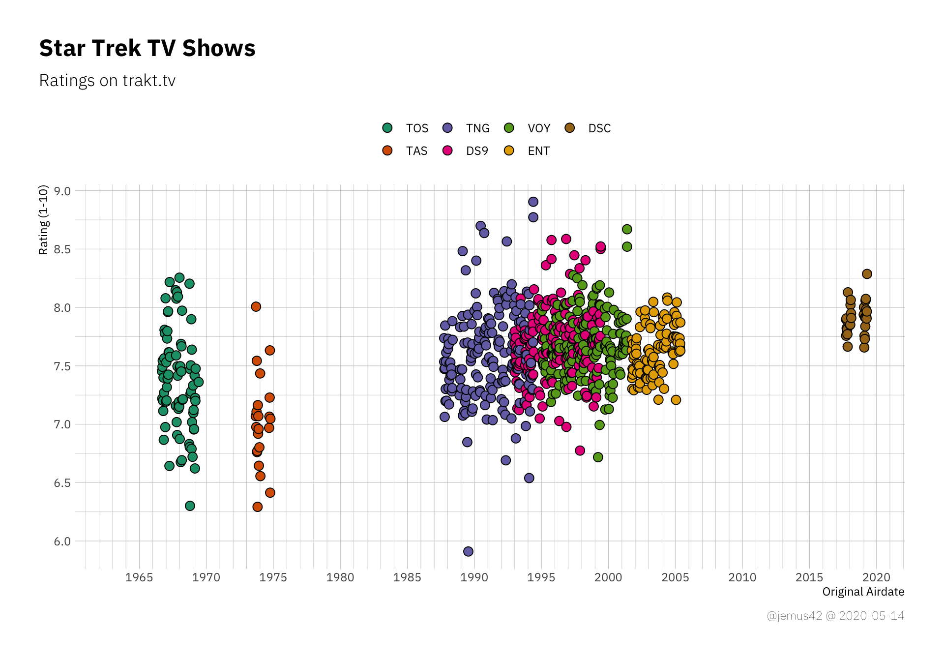
| |
But random internet guy, people will now exclaim, isn’t it bad to use a truncated y-axis? they will ask, smugly. And yes, in many situations it’s a bad idea to truncate axes of quantities with a known range like a 1-10 point scale, so here’s the same plot as above with “proper” limits:
| |
The thing is, it’s harder to see differences within individual shows. It’s a more or less uniform strip of points, which doesn’t really help that much, so I’ll probably stick to the truncated axes.
Within-Show Variation Link to heading
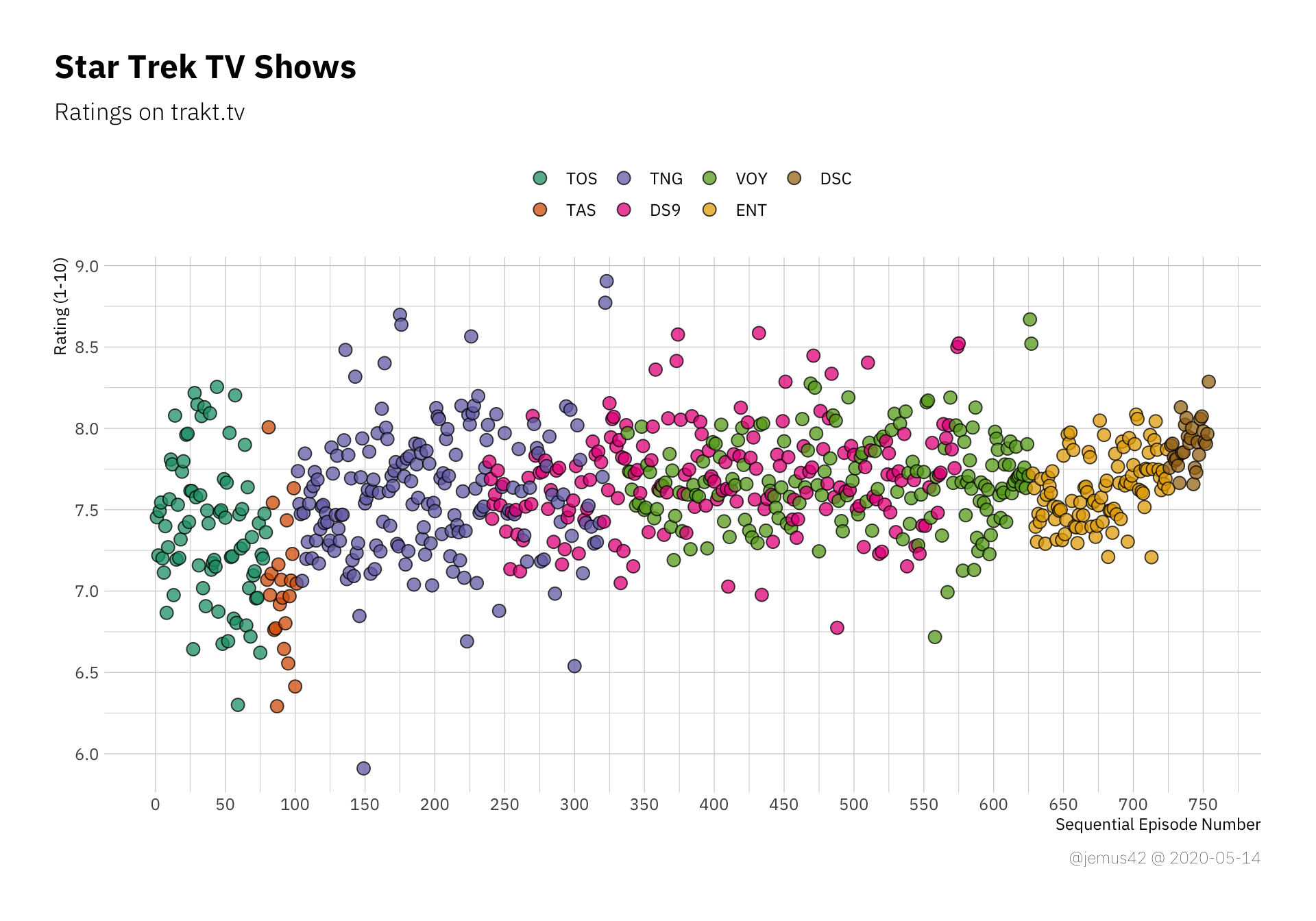
Next up we’ll be looking at the variation within each show’s rating, with respect to each show’s total number of episodes.
| |
We can see TNG with a lot of variation compared to the relatively consistent Enterprise. Also, there are quite a few outliers in TNG, so apaprently there are some really good episodes, and a few really bad episodes (relatively speaking). We’ll be looking at the outliers a little later.
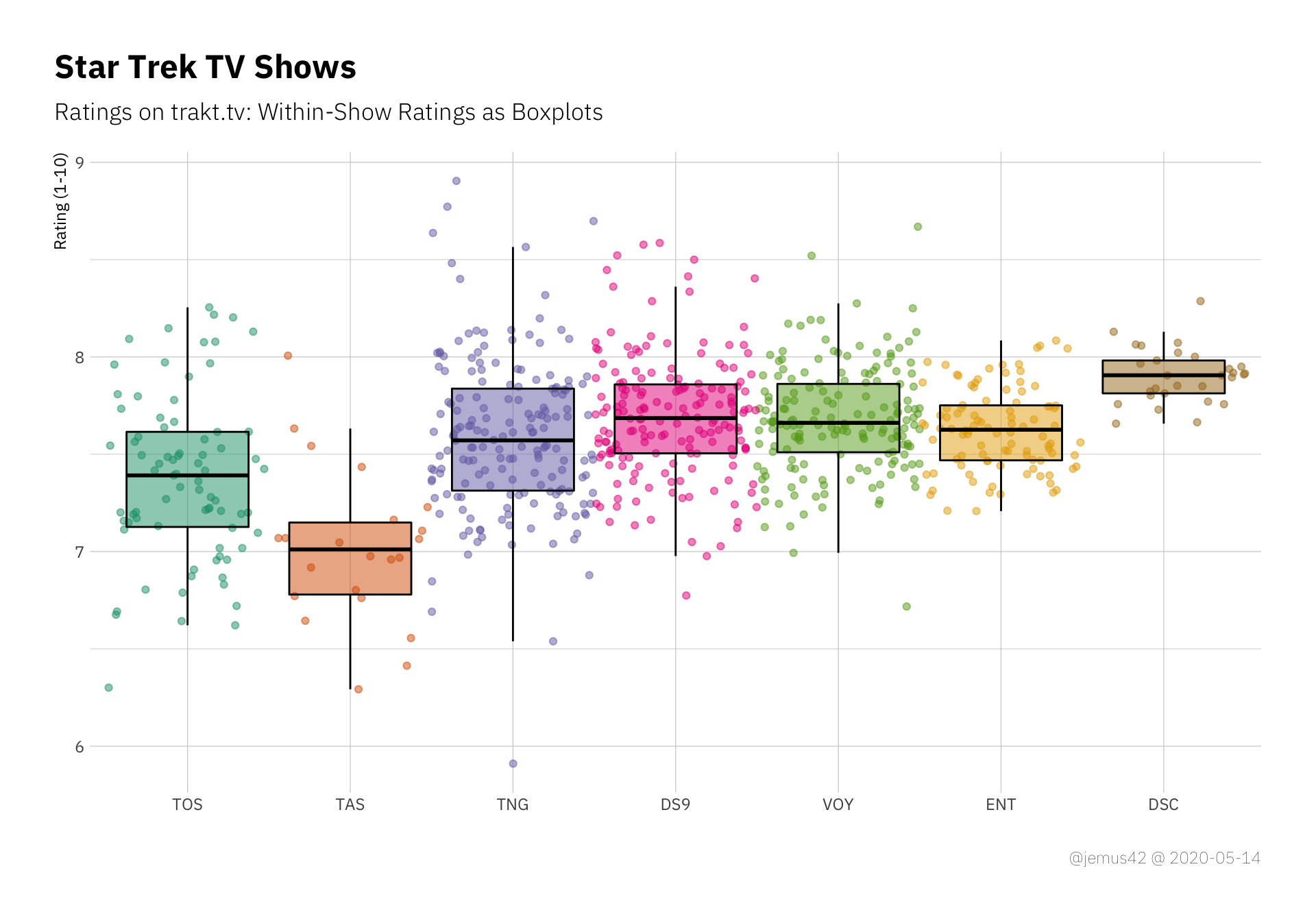
Next up I’d like to look at the ratings of individual seasons of each shows, where we’ll be using boxplots again, but this time per season.
| |
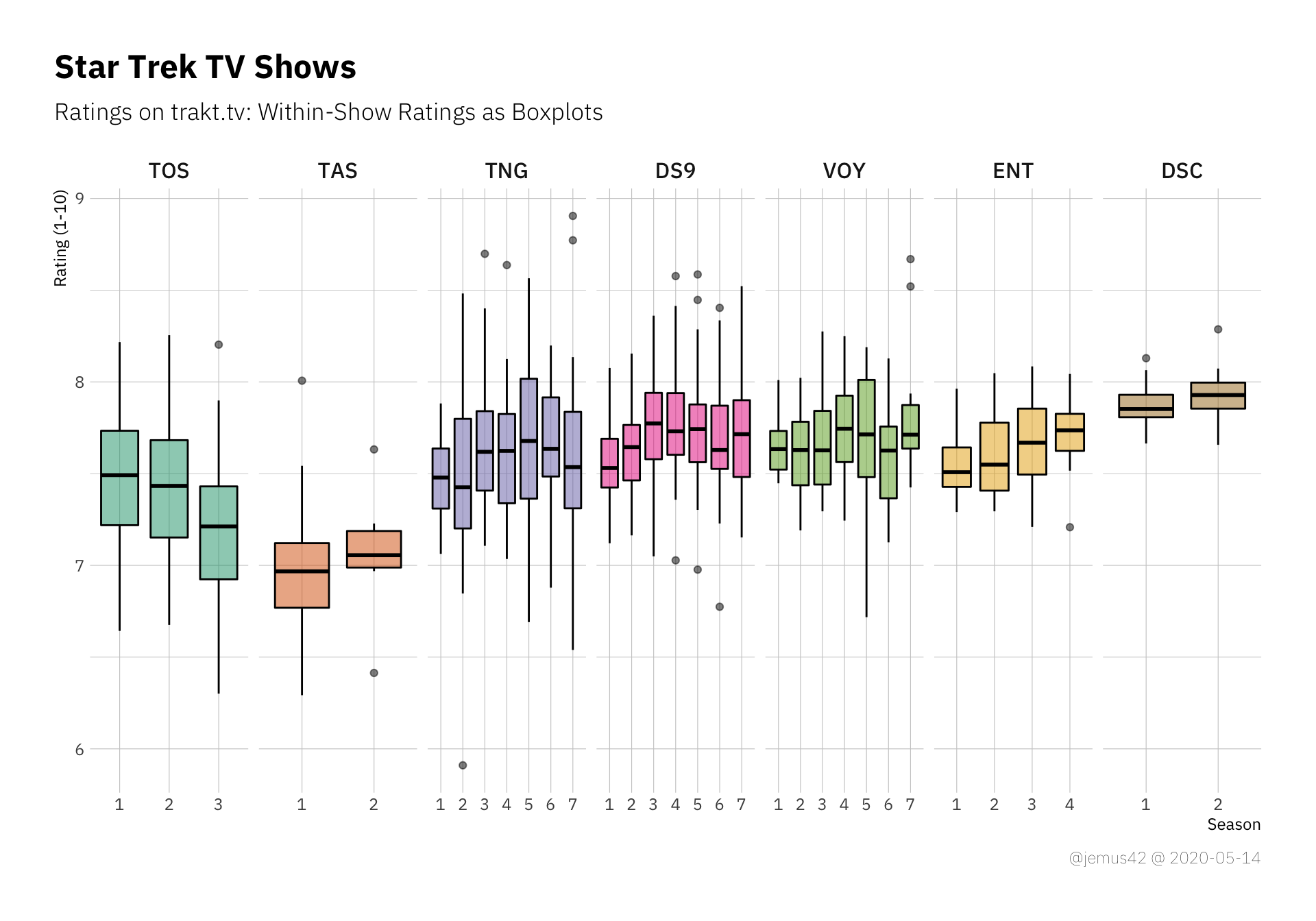
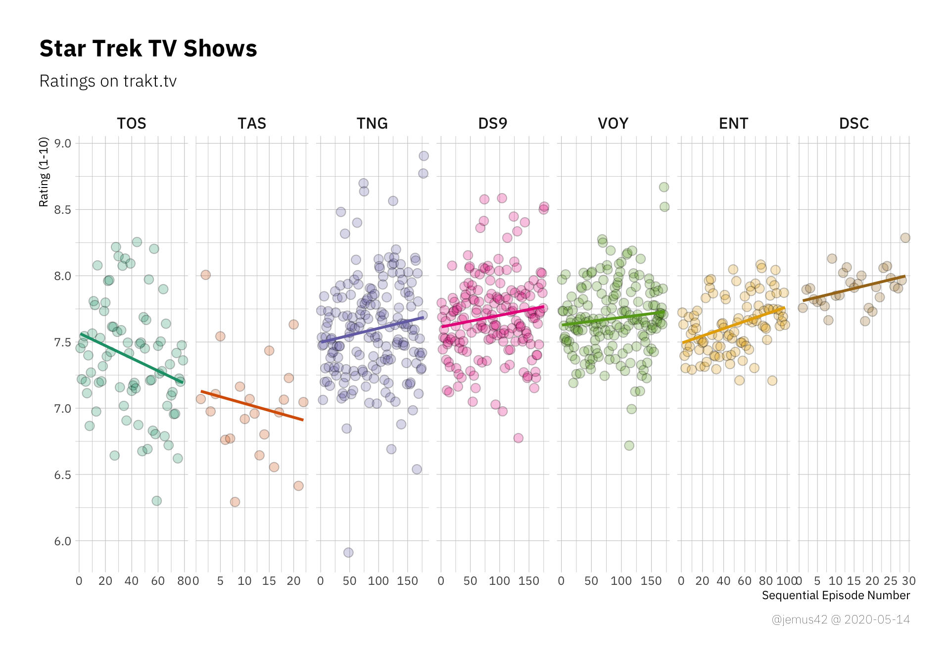
You might notice a few trends, like TOS getting technically worse over time, while DS9 and ENT seem to be getting better over time. I vaguely remember analyzing the seasonal trends of ENT in an earlier blogpost, where I also did some simple statistics to “prove” that the show gets better over time. We can make these trends a little more explicit by using simple linear regression to approximate the ratings over time, where time is just the sequential episode number. A rising trendline would indicate the show getting better towards the end and vice versa. It’s a little too early to evaluate Discovery in this manner, but at least we can see that apparently people really enjoyed the Fall Finale™. In other news, I think it’s safe to say that apparently nobody liked TAS, so… yeah. There’s that.
| |
How Do You Feel About Histograms? Link to heading
We’ve seen the individual episode ratings, but how about the general distribution of all the ratings regardless of the show? Just a big distribution which tells us the rough range the ratings seem to be in seems appropriate. It should also be noted that in my experience, ratings on trakt.tv don’t seem to vary that greatly, but rather seem to fall in the range between 6 and 9. My working hypothesis is that people tend to, well, watch and rate things they enjoy at least a bit, and if they really dislike it and would rate it 5 or lower, they don’t go through to watch and rate the whole shebang. Anyway, my point being: The ratings might be a little biased, but I think we’re already aware that the trakt.tv user ratings are not a perfect cross-section of society as a whole, so… yeah, I’m fine with that.
| |

In this histogram we see that most ratings fall in a relatively thin range around ~7.6, which is a solid “yeah, cool” I guess. There’s only one episode below the 6.0 line, which falls into meh-territory, so that’s interesting.
Besides that we observe a perfectly “pretty normal” distribution, which shouldn’t be surprising considering we have a total \(N = 754\).
| |
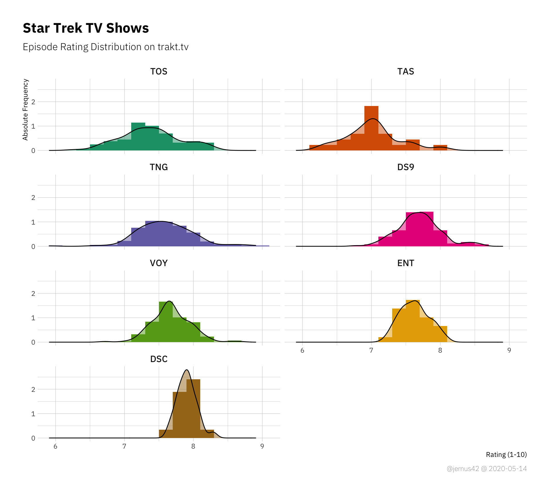
In a by-show plot of distributions, we can now use the width of the distributions to estimate the variance within each show, but we kind of did that already earlier. It could be nice to look at the skew of each distribution, but I don’t think there’s that much to gain here.
The First Seasons Link to heading
If I remember correctly, Jason Snell mentioned that the first season of any Star Trek tended to be not that great, which is why you should probably not jump to conclusions regarding Discovery’s quality just by the first few episodes. So I plotted all the first seasons in one handy graph, where I rescaled the x-axis to a relative number of percentage of episodes of first seaosn, which allows a better comparison. Note that at the time of this writing the first season of Discovery is not yet concluded, but we already saw the silly named Fall Finale™ and know the season will consist of 15 episodes, so I adjusted appropriately.
| |
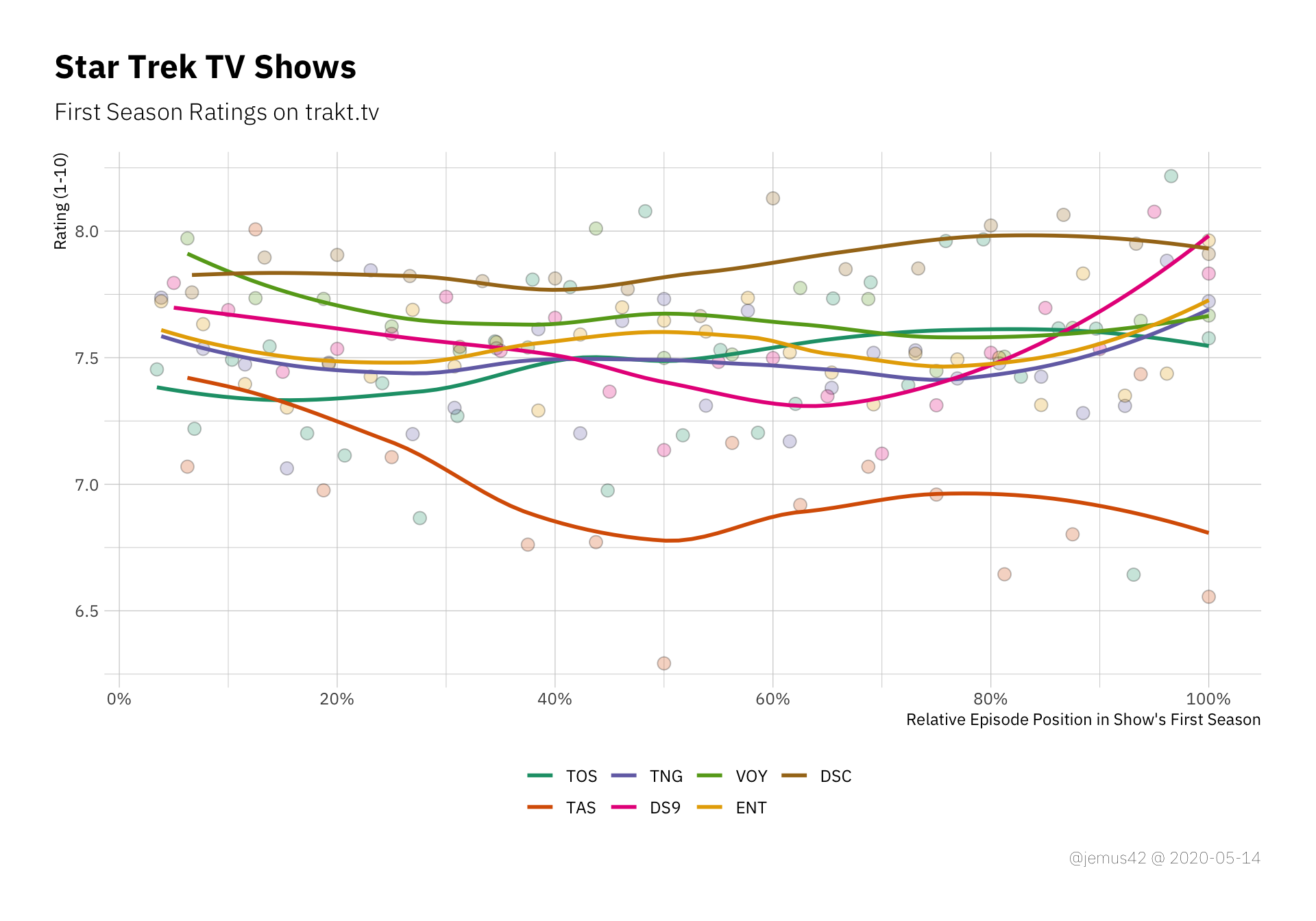
First-season episode ratings. The x-axis is computed by dividing the episode number by the total number of episodes in each season
Or, if you prefer the boxplot way of life:
| |
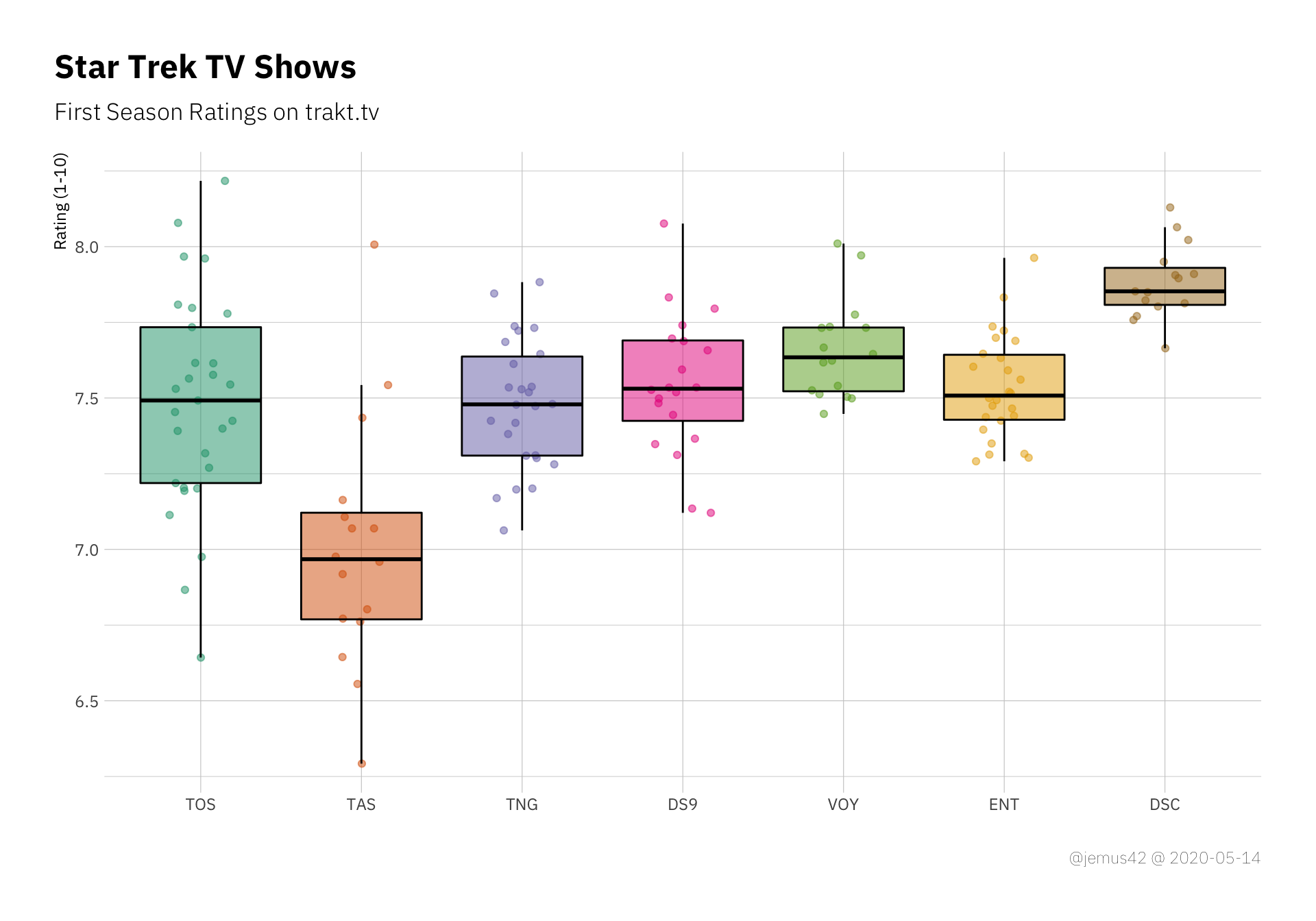
First season episode ratings as boxplots with background dots
I guess it’s fair to say that Discovery is doing pretty well so far, but it should also be noted that most of the ratings of previous shows were presumably made during rewatches, since trakt hasn’t been around that long. So either DSC is doing pretty good or it’s impossible to actually make a statement about the first-season-hypothesis based on the data, so I opt for the interpration that makes it interesting.
The Best and the Worst Episodes Link to heading
Ah yes, the thing with the outliers. In the following plot, I’ve labelled each episode with regards to whether or not is in an outlier, which I have defined in this case to be any value that deviates more than two IQR from the median. What an IQR range is a thing that you either know or are googleing now, and well let’s face it, it’s not important. Anyway, I labelled the outliers with their episode ID (e.g. s02e03) and the episode title.
| |
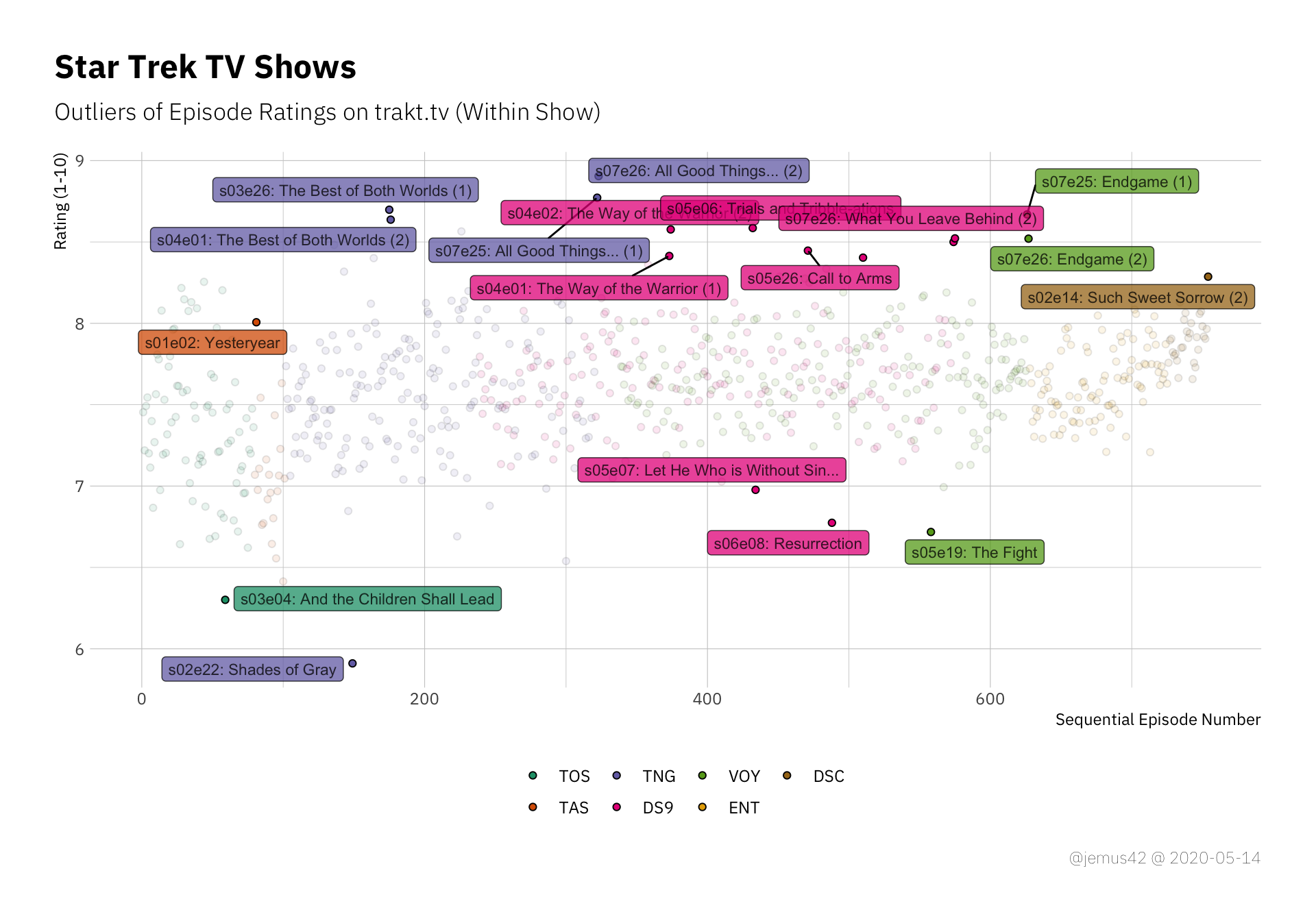
Positive and negative outliers of each show. Outliers are defined in this case as deviating more than two IQR from the median.
It’s nice how DS9 seems to have a lot of positive outliers with only two negative outliers, which indicates that DS9 is not that great on average, but a couple of episodes are pretty good. At least that’s the way I interpret it, not sure if that’s a realistic assessment. Additionally we can see that TNG takes the cake for both the best and the worst liked episodes all over, so… yay TNG I guess? Idunno.
Inter-Show Comparisons Link to heading
Let’s compare all the shows in the statsy way with a simple ANOVA by show. If this results in a significant result, which it probably will, it indicates that at least one show has a significantly different variation than the other shows.
| |
Table 1: One-Way ANOVA: Using Type III Sum of Squares
| Term | df | SS | MS | F | p | \(\eta^2\) | Cohen’s f | Power |
|---|---|---|---|---|---|---|---|---|
| show_abr | 6 | 16.5 | 2.75 | 25.11 | < .001 | 0.17 | 0.45 | 1 |
| Residuals | 747 | 81.82 | 0.11 | |||||
| Total | 753 | 98.32 | 2.86 |
Welp, I don’t have to look at the pariwise comparisons to tell you that TAS is the odd one out because it’s obviously rated consistently lower than the others. To make it more interesting, we’ll look at the remaining shows if we kick out TAS:
| |
Table 2: One-Way ANOVA: Using Type III Sum of Squares
| Term | df | SS | MS | F | p | \(\eta^2\) | Cohen’s f | Power |
|---|---|---|---|---|---|---|---|---|
| show_abr | 5 | 8.54 | 1.71 | 15.8 | < .001 | 0.1 | 0.33 | 1 |
| Residuals | 726 | 78.5 | 0.11 | |||||
| Total | 731 | 87.04 | 1.82 |
Well I’ll be damned. Who’da thunk.
The effect ($\eta^2$ and \(f\)) is much smaller than before, but we have a lot of statistical power, presumably due to the large sample size.
Let’s look at the pairwise comparisons:
| |
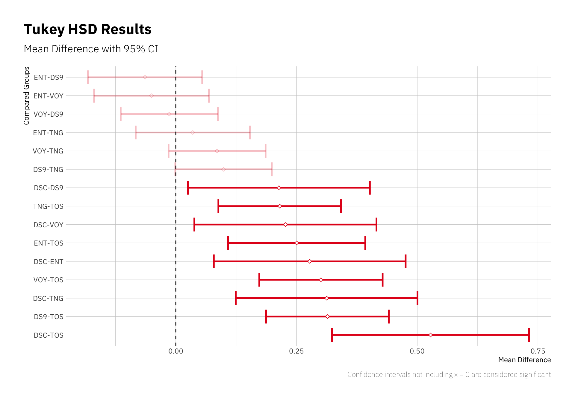
These errorbars indicate which pairwise comparison (e.g. “mean rating of ENT minus mean rating of DS9” in the first row) results in a significant difference from 0, assuming that if the shows have the same mean rating, the difference would be 0. The direction of the difference is determined by the labels to the left, as mentioned, so we can say that TOS is “significantly worse” than Voyager, at least according to mean episode ratings and variation.
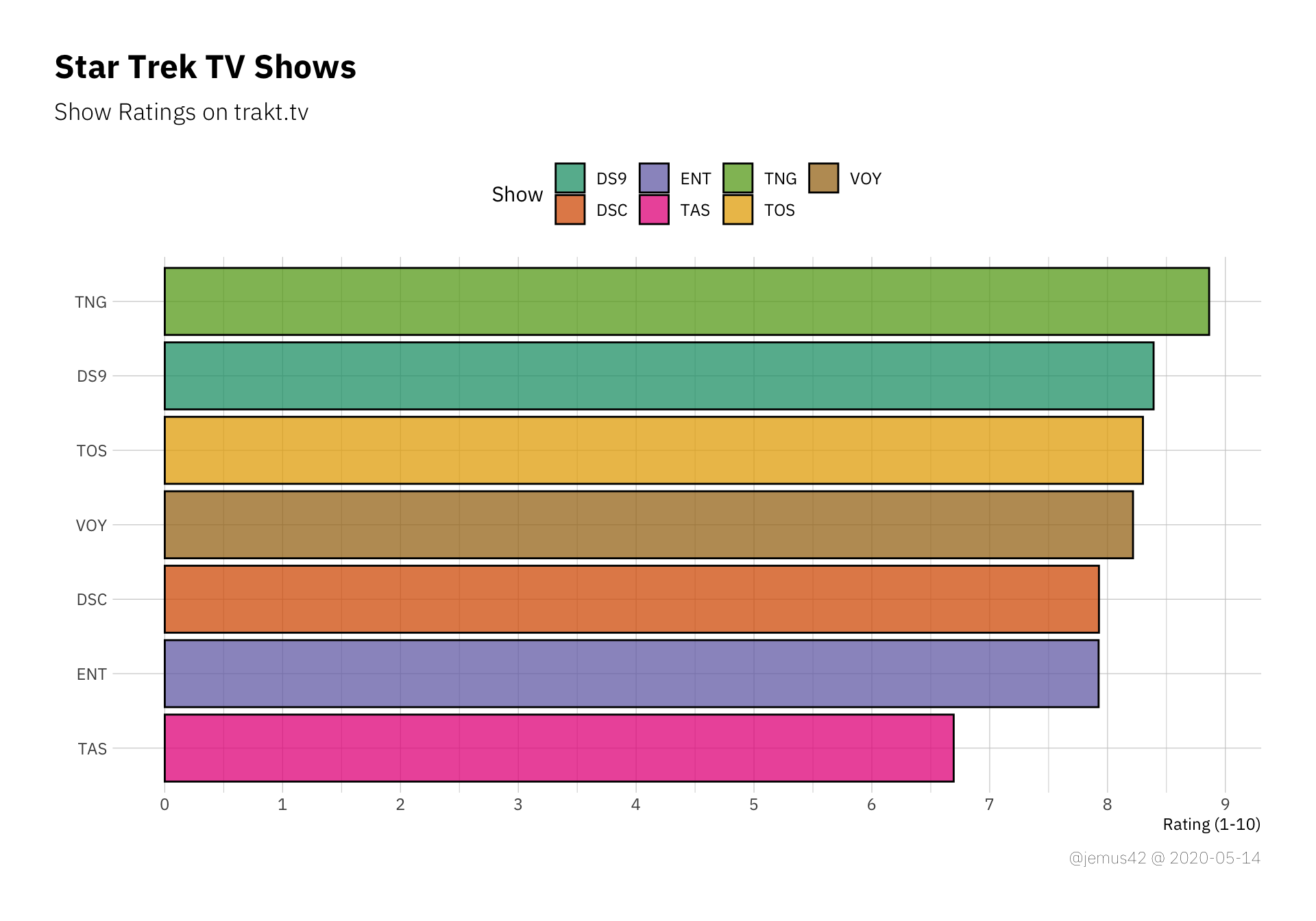
The lasr thing I’d like to take a look at is the possible difference between the total show rating on trakt and the mean episode rating of each show. Since you have the option to give each show an over-all rating without rating each episode, I’m assuming that the nostalgia factor is strong in that regard and many people might give TNG a nostalgia-inflated rating compared to people who rewatched each episode and rated them as they judge them today(ish). Long story short, here’s the over-all show ratings, sorted by rating:
| |
Now we can use that plot and build upon it. I’ll draw the mean episode rating for each show including errorbars on top of the previous plot, so hold my beer:
| |

Neat. These little tie-fighters (wrong franchise, I know) represent the mean episode rating with its confidence interval. What we can learn from that plot is how TNG has a high show rating, but individual episodes tend to be rated lower on average when compared to the over-all show rating. Interestingly, it’s the other way around fpr TAS, where the average episode rating is higher than the show rating, so apparently people who remember it liked it better than the people who watched it? Not quite sure, but I’m certain you can figure out a way to rationalize this effect, I’m out ¯\_(ツ)_/¯
On the other hand, Discovery is very consistent with its mean episiode rating CI enclosing the current show rating over all. That’s neat. If you disagree, don’t email me.