There are some shows that are/were really popular, everyone is excited about them, and then they go down the drain in a both abrupt and spectactular kind of way. Some take their time over a whole season, others have you hoping (and quite possibly in denial) until the end, and then they just kick you in the ol’ hope organ.
I was wondering (for no particular recent-eventsy kind of reason at all, I swear) if some of the shows I recall being considered “bad enders” have something in common, or more interestingly, end badly, differently.
shows<-tribble(~show,~slug,"Dexter","dexter","Lost","lost-2004","How I Met Your Mother","how-i-met-your-mother","Scrubs","scrubs","Battlestar Galactica (2003)","battlestar-galactica-2003","Game of Thrones","game-of-thrones")if(!file.exists("episodes.rds")){episodes<-purrr::pmap_df(shows,~{trakt.seasons.summary(.y,extended="full",episodes=TRUE)%>%pull(episodes)%>%bind_rows()%>%select(-available_translations)mutate(show=.x,season=as.character(season),episode_abs=seq_along(first_aired))})saveRDS(episodes,"episodes.rds")}else{episodes<-readRDS("episodes.rds")}
Here’s the highest rated episodes per show to get started:
 1
 2
 3
 4
 5
 6
 7
 8
 9
10
11
12
13
14
15
16
17
episodes%>%group_by(show)%>%top_n(3,rating)%>%arrange(rating,.by_group=TRUE)%>%mutate(rating=round(rating,1))%>%select(show,season,episode,title,rating)%>%kable(col.names=c("Show","Season","Episode","Title","Rating"),caption="Top 3 episodes per show",digits=2)%>%kable_styling(bootstrap_options=c("condensed"))%>%collapse_rows(1)
Table 1: Top 3 episodes per show
Show
Season
Episode
Title
Rating
Battlestar Galactica (2003)
4
20
Daybreak (2)
8.5
3
4
Exodus (2)
8.6
3
20
Crossroads (2)
8.6
Dexter
7
12
Surprise, Motherfucker!
8.7
6
12
This is the Way the World Ends
8.9
4
12
The Getaway
8.9
Game of Thrones
7
4
The Spoils of War
8.8
6
10
The Winds of Winter
8.8
6
9
Battle of the Bastards
8.9
How I Met Your Mother
7
24
The Magician's Code: Part Two
8.4
2
9
Slap Bet
8.4
8
12
The Final Page: Part Two
8.6
Lost
5
17
The Incident (2)
8.4
4
5
The Constant
8.5
3
23
Through The Looking Glass (2)
8.5
Scrubs
3
14
My Screw Up
8.4
8
18
My Finale
8.4
5
20
My Lunch
8.4
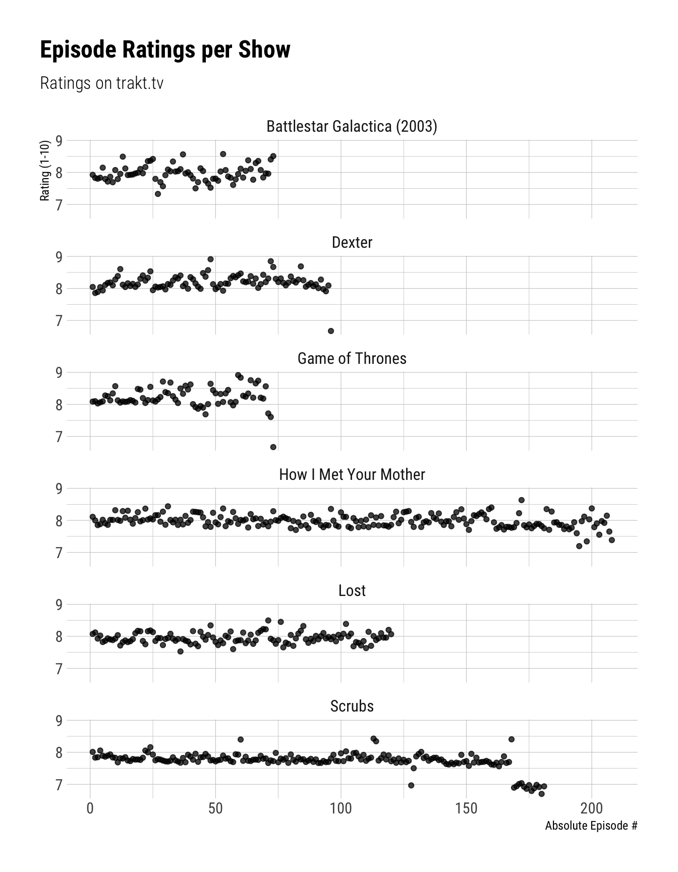
Per-episode ratings are always neat to look at.
1
2
3
4
5
6
7
8
9
10
ggplot(episodes,aes(x=episode_abs,y=rating))+geom_point(alpha=.75)+scale_y_continuous(breaks=0:10,minor_breaks=seq(0,10,.5))+facet_wrap(~show,ncol=1)+labs(title="Episode Ratings per Show",subtitle="Ratings on trakt.tv",x="Absolute Episode #",y="Rating (1-10)")
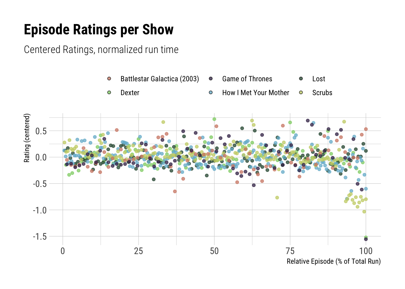
Since I’m primarily interested in the rating of the ending compared to the average for the specific show, we’ll standardize the ratings using mean and standard deviation of each show. Just in case, we’ll get both centered and standardized ratings.
episodes<-episodes%>%group_by(show)%>%mutate(rating_c=rating-mean(rating),rating_z=rating_c/sd(rating))episodes%>%group_by(show)%>%filter(rating==max(rating)|rating==min(rating))%>%arrange(rating,.by_group=TRUE)%>%mutate_at(vars(starts_with("rating")),~round(.x,1))%>%select(show,season,episode,title,starts_with("rating"))%>%kable(col.names=c("Show","Season","Episode","Title","Rating","Rating (centered)","Rating (standardized)"),caption="Best and worst episode by show with centered/standardized ratings")%>%kable_styling(bootstrap_options=c("condensed"))%>%collapse_rows(1)
Table 2: Best and worst episode by show with centered/standardized ratings
Show
Season
Episode
Title
Rating
Rating (centered)
Rating (standardized)
Battlestar Galactica (2003)
2
14
Black Market
7.3
-0.6
-2.5
3
20
Crossroads (2)
8.6
0.6
2.3
Dexter
8
12
Remember the Monsters?
6.7
-1.5
-6.0
4
12
The Getaway
8.9
0.7
2.9
Game of Thrones
8
6
The Iron Throne
6.7
-1.6
-4.7
6
9
Battle of the Bastards
8.9
0.7
2.1
How I Met Your Mother
9
11
Bedtime Stories
7.2
-0.8
-3.9
8
12
The Final Page: Part Two
8.6
0.6
3.2
Lost
2
12
Fire + Water
7.5
-0.4
-2.4
3
23
Through The Looking Glass (2)
8.5
0.5
3.1
Scrubs
9
12
Our Driving Issues
6.7
-1.0
-3.8
5
20
My Lunch
8.4
0.7
2.5
Plot them all together:
1
2
3
4
5
6
7
8
9
10
11
12
ggplot(episodes,aes(x=episode_abs,y=rating_c,color=show,fill=show))+geom_point(alpha=.75,shape=21)+scale_color_ipsum(guide=FALSE)+scale_fill_ipsum()+scale_y_continuous(breaks=seq(-10,10,.5),minor_breaks=seq(-10,10,.25))+labs(title="Episode Ratings per Show",subtitle="Centered Ratings",x="Absolute Episode #",y="Rating (centered)",fill="")
We should also normalize the episode count, so we’ll take the absolute episode number and scale them to the interval [0, 100] — then we can interpret it as a percentage of total show run time.
 1
 2
 3
 4
 5
 6
 7
 8
 9
10
11
12
13
14
15
16
17
18
episodes<-episodes%>%group_by(show)%>%mutate(episode_rel=(episode_abs/max(episode_abs))*100)ggplot(episodes,aes(x=episode_rel,y=rating_c,color=show,fill=show))+geom_point(alpha=.75,shape=21)+scale_color_ipsum(guide=FALSE)+scale_fill_ipsum()+scale_y_continuous(breaks=seq(-10,10,.5),minor_breaks=seq(0,10,.25))+labs(title="Episode Ratings per Show",subtitle="Centered Ratings, normalized run time",x="Relative Episode (% of Total Run)",y="Rating (centered)",fill="")
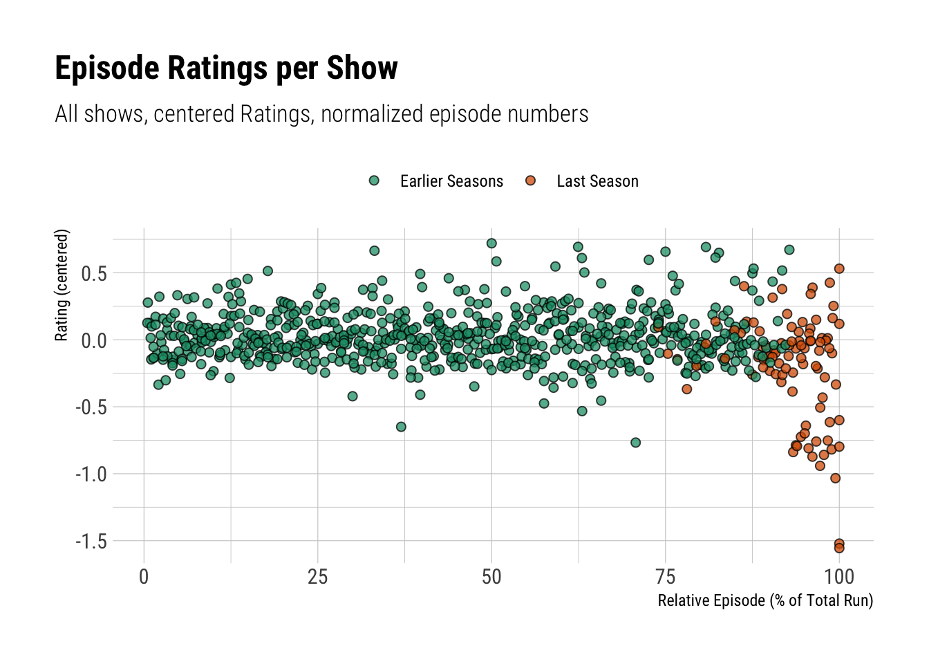
For display purposes, we’ll categorize the last season and last episode respectively.
Now we’ll look at the previous plot, but highlight the last seasons of our shows:
 1
 2
 3
 4
 5
 6
 7
 8
 9
10
11
ggplot(episodes,aes(x=episode_rel,y=rating_c,fill=is_last_season))+geom_point(size=2,alpha=.75,shape=21)+scale_fill_brewer(palette="Dark2")+#scale_y_continuous(breaks = 0:10, minor_breaks = seq(0, 10, .5)) +labs(title="Episode Ratings per Show",subtitle="All shows, centered Ratings, normalized episode numbers",x="Relative Episode (% of Total Run)",y="Rating (centered)",fill="")
Welp, not for all, but for most shows in the mix we’re seeing quite a noticable dip at the end there.
 1
 2
 3
 4
 5
 6
 7
 8
 9
10
11
12
13
14
15
16
17
18
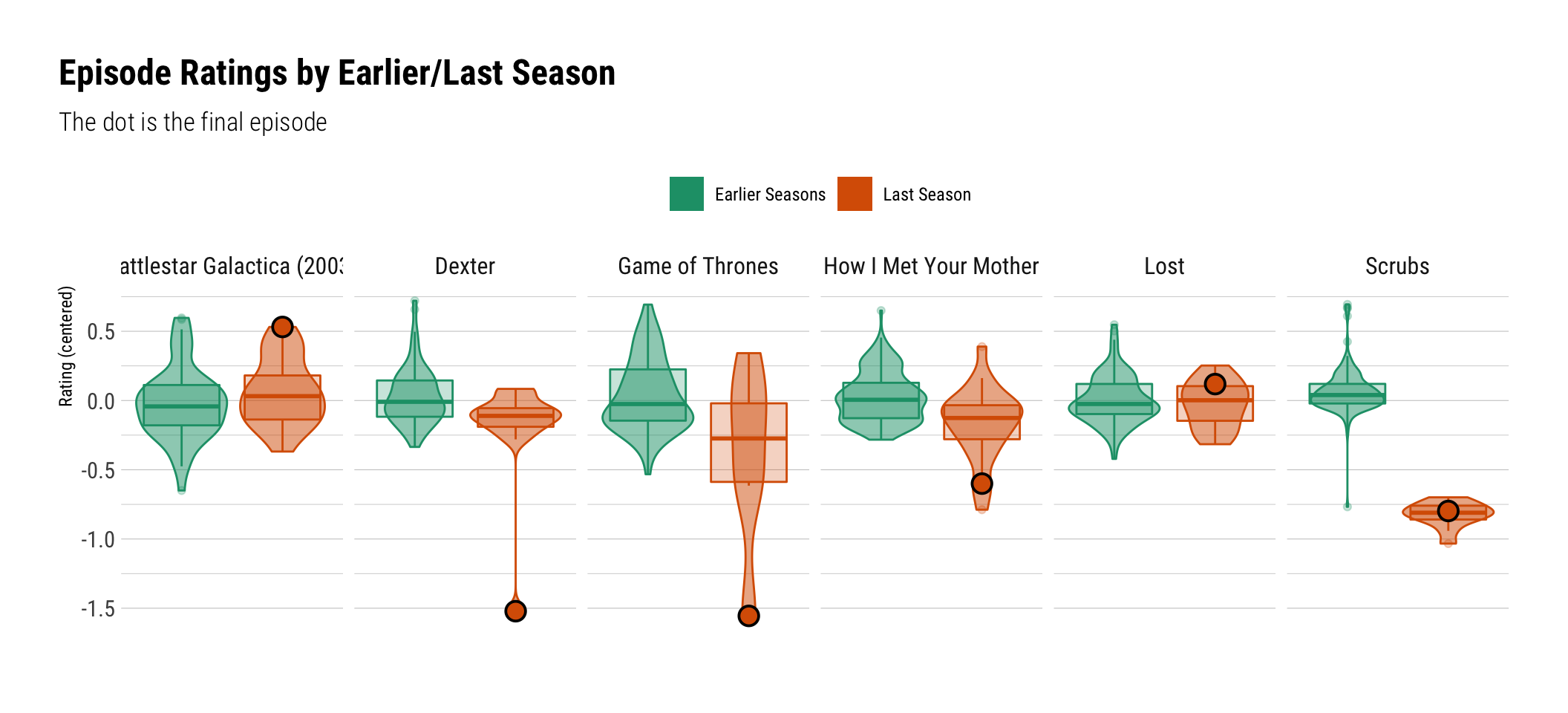
ggplot(episodes,aes(x=is_last_season,y=rating_c,color=is_last_season,fill=is_last_season))+geom_boxplot(alpha=.25)+geom_violin(alpha=.5)+geom_point(data=episodes%>%filter(is_last_episode=="Finale"),shape=21,size=4,color="black",stroke=1,key_glyph="rect")+facet_wrap(~show,nrow=1)+scale_x_discrete(breaks=NULL)+scale_fill_brewer(palette="Dark2",aesthetics=c("color","fill"))+labs(title="Episode Ratings by Earlier/Last Season",subtitle="The dot is the final episode",x="",y="Rating (centered)",color="",fill="")
Last Seasons: A Boxplot
This is probably the most useful plot so far. Not only can we distinguis between the final season’s ratings and the remainder of the show, but we can also see if the finale itself was rated particularly differently.
I think it’s fair to say that “bad endings” and “controversial endings” are different categories. While BSG and Lost both have endings that left many people unsatisfied, they’re still not noticably lower rated then the remainder of the show – on the contrary even, they’re above average.
Then there’s the case of the bad last season. While Scrubs didn’t have a band ending per-se, it’s just that the whole last season was just too big of a departure from what people liked about the show before, namely, well, the cast for one thing.
And then there’s the “well this is just bullshit” endings. Here we find Dexter, How I Met Your Mother, and of course, Game of Thrones. These endings are special – they’re not “bad because I didn’t like it”-bad, they’re “bad because it doesn’t make any sense in the context of the hours and hours of previous material”.